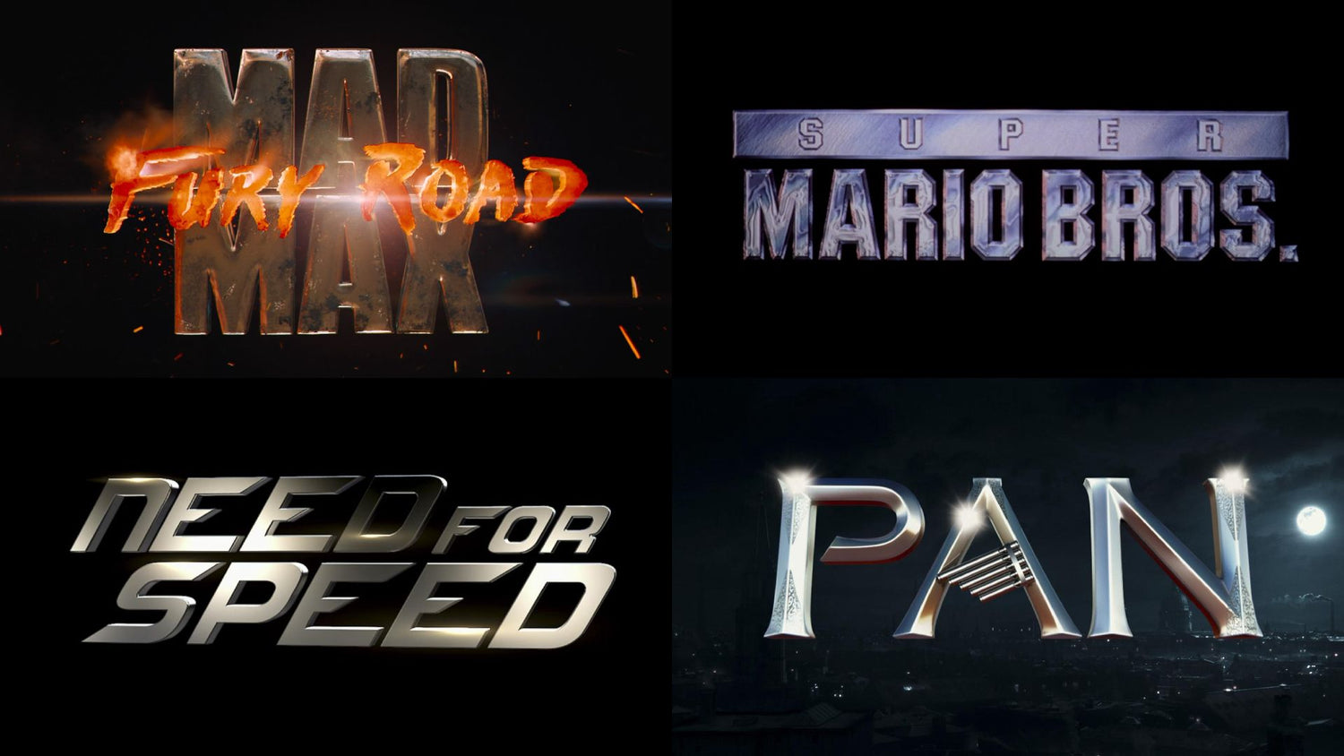
The 'chrome text effect' stands as a testament to the innovative spirit of cinema, offering a glimpse into the future while anchoring movies in a luxurious past. From the rugged dystopia of Mad Max (1979) to the intricate desert landscapes of both Dune (1984) and its visually stunning 2021 counterpart, chrome typography has mesmerised audiences, becoming a staple in Hollywood's visual lexicon.
Origins of Chrome Typography in Film: From Mad Max to Dune
The journey of chrome text effect in cinema parallels technological advancements, with early adopters leveraging typography to convey themes of strength and futurism. Films like Mad Max introduced audiences to a visual shorthand for resilience, employing gradients and layering to craft text that was as impactful as the stories they headlined.
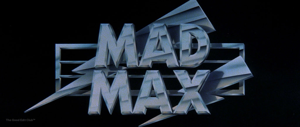
Mad Max (1979, Director: George Miller)
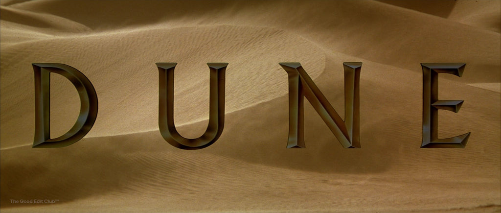
Dune (1984, Director: David Lynch)
The Psychological Impact of Metallic Typography in Movies
Metallic typography resonates on a psychological level, signalling luxury, adventure, and forward-thinking. It's not just the visual impact of the chrome that captivates but the meticulous craftsmanship behind it. Techniques such as text shadows and gradient layering enhance the tactile quality of titles, bridging the gap between the audience and the cinematic experience.
Chrome Text in Cinema: A Comparative Study of Iconic Titles
Metallic Typography in Sci-Fi & Fantasy: The Evolution from Dune to Fantastic Beasts
The Dune franchise showcases the evolution of chrome effects, with the 2021 remake employing advanced customization to reflect the story's vastness and complexity. Similarly, the metallic elements in the Harry Potter and Fantastic Beasts series use styles and gradients to evoke magic and wonder.
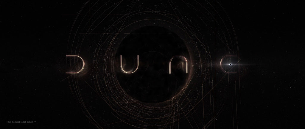
Dune: Part One (2021, Director: Denis Villeneuve)
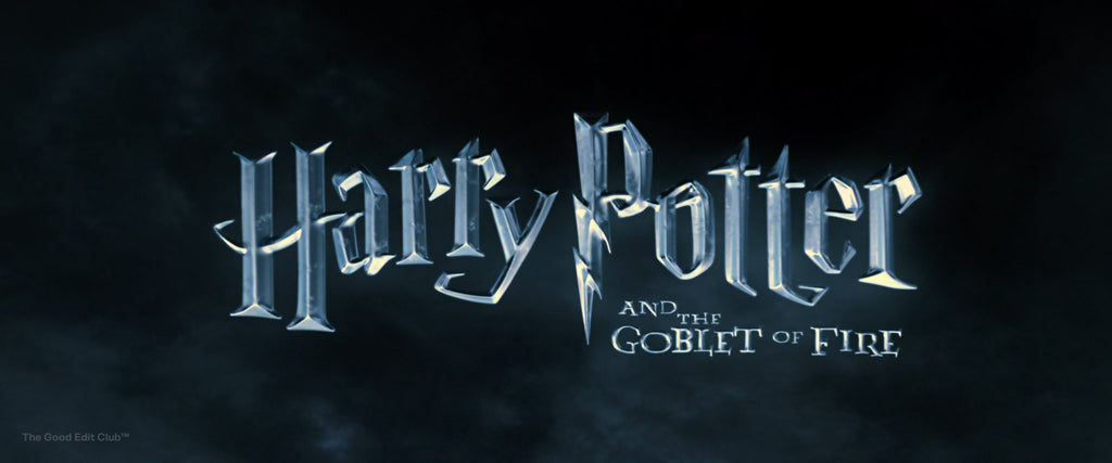
Harry Potter and the Goblet of Fire (2005, Director: Mike Newell)
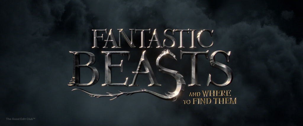
Fantastic Beasts and Where to Find Them (2016, Director: David Yates)
Action and Adventure: How Chrome Text Elevates Transformers and Need for Speed
Transformers films utilise chrome text to echo themes of technology and exhilaration. This effect is mirrored in Need for Speed (2014), where typography conveys speed and intensity, emphasising the narrative's pace.
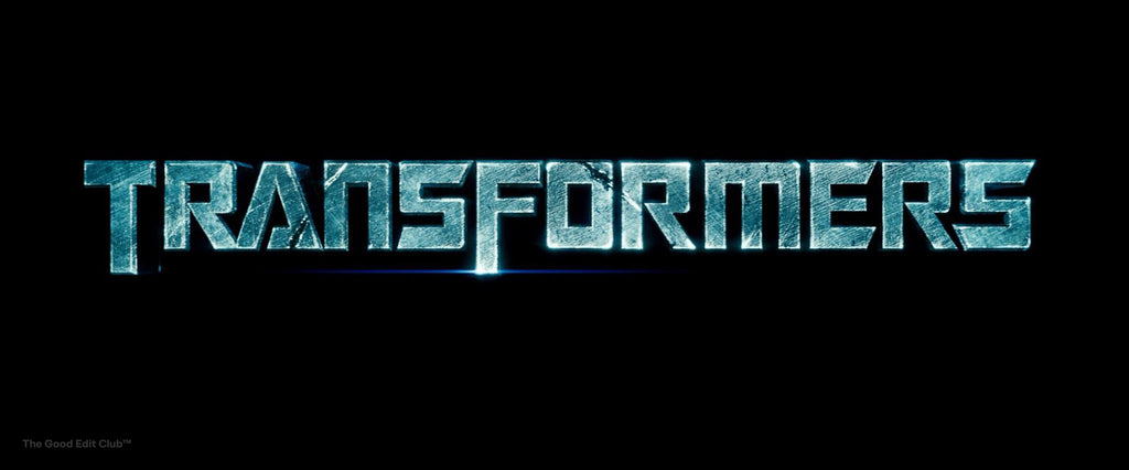
Transformers (2007, Director: Michael Bay)
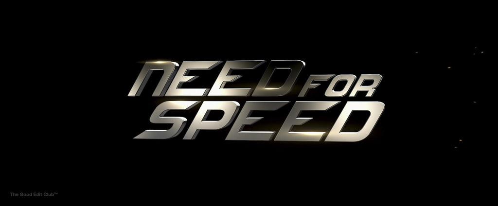
Need for Speed (2014, Director: Scott Waugh)
Epic Sagas and Reimagined Fairy Tales: The Role of Chrome Typography in Back to the Future and Cinderella
Back to the Future and The Amazing Spider-Man utilise metallic typography to promise adventure and heroism. Fairy tale adaptations like Cinderella (2015) and Pan (2015) employ chrome effects to imbue the narrative with a timeless, magical quality.
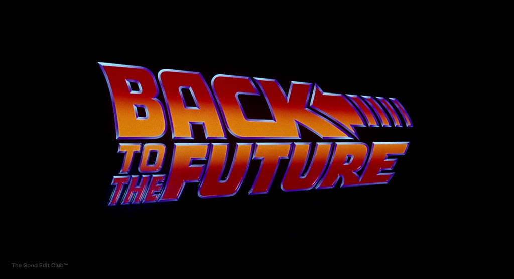
Back to the Future (1985, Director: Robert Zemeckis)
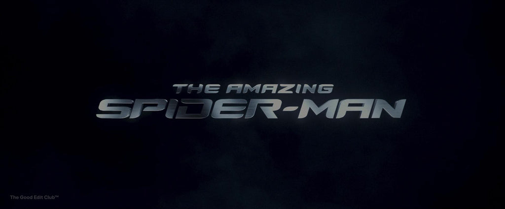
The Amazing Spider-Man (2012, Director: Marc Webb)
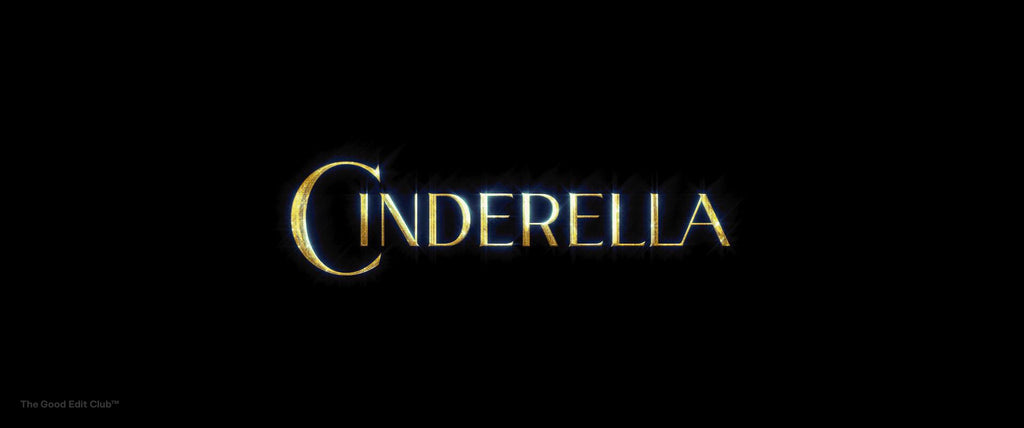
Cinderella (2015, Director: Kenneth Branagh)
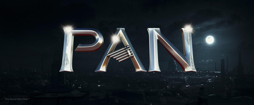
Pan (2015, Director: Joe Wright)
Modern Applications of Chrome Text Effect in Cinema and Digital Branding
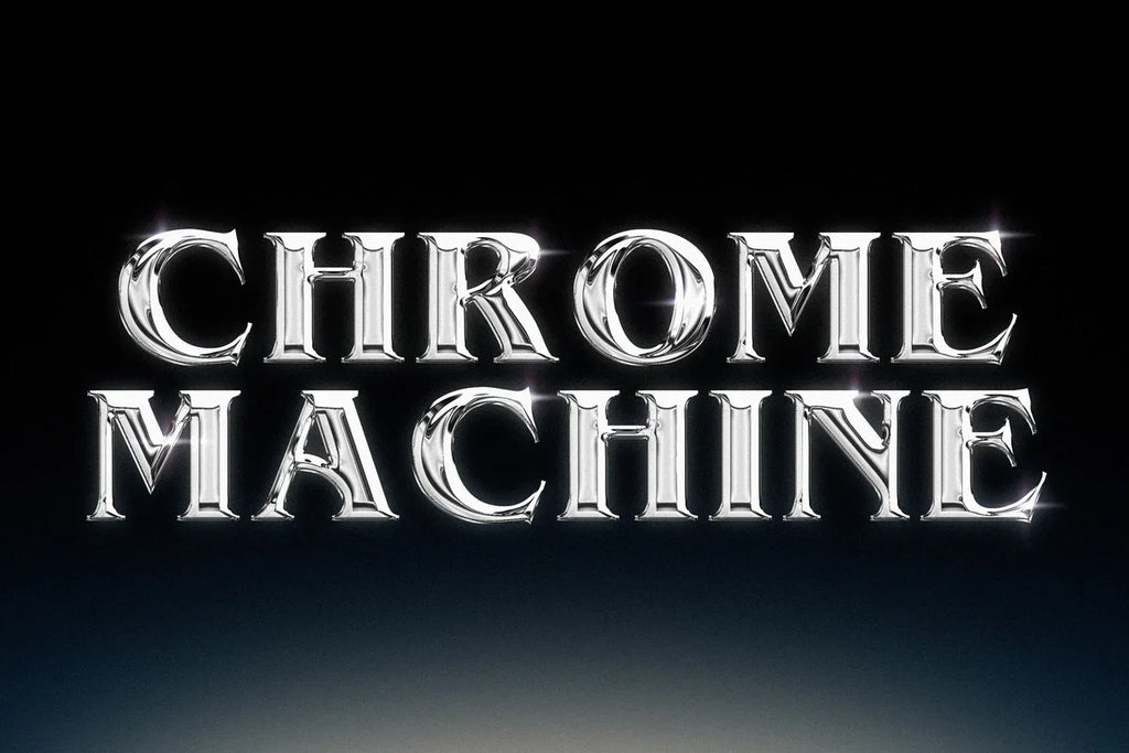
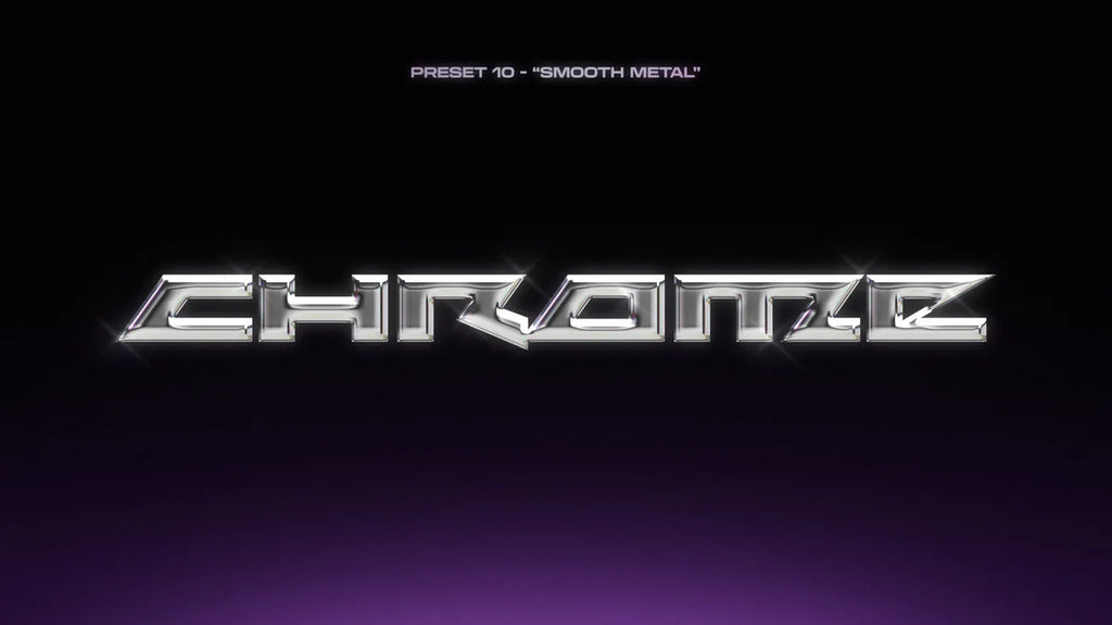
As digital platforms evolve, the application of chrome typography extends beyond cinema, influencing video games and online content. Tools like Chrome Machine democratise this iconic style, offering customization options that cater to a wide range of creative projects.
Psychological Lure: Why Metal Appeals
The omnipresence of metallic typography in filmography can be traced to its psychological impact. Metal connotes strength, durability, and wealth, characteristics intrinsically enticing to humans. This allure translates to a subconscious expectation of a film that is robust in production, rich in narrative, and constructed with a painstaking attention to detail. The shimmer of chrome and the lustre of gold signal a premium cinematic experience before the narrative even unfolds.
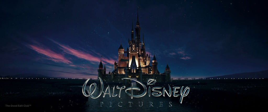
Walt Disney Pictures Ident
Metallic typography reaches into our collective psyche, tapping into an ancestral appreciation for the precious and the powerful. It signals a blend of tradition and innovation, promising viewers a story tempered like steel, with the sheen of contemporary visual effects. The metallic shimmer acts as a beacon that lures the audience into the theatre with the promise of spectacle and narrative strength.
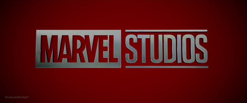
Marvel Studios Ident
The Perception of Value and Quality
Metallic typography in film titles perpetuates a sense of high value and unparalleled production quality.
- Solidity and Permanence: Metal suggests sturdiness, implying the film is grounded in quality.
- Luxury and Prestige: The association with precious metals infers a level of exclusivity.
- Technological Advancement: The use of 3D extrusion signifies cutting-edge visual effects.
- Heritage and Timelessness: A nod to classic filmmaking, yet polished with modern aesthetics.
- Attention to Detail: Reflects the meticulous craftsmanship behind the movie’s production. Audiences often associate metallic elements with opulence and sophistication. These qualities appeal to a universal audience, signalling an experience that exceeds ordinary expectations.
Visual Impact: Catching the Viewer’s Eye
Cinematic experiences are heightened by the evocative strength that metallic typography brings to a film's opening moments. (FYI: NoFilmSchool have some great articles on title sequences)
- Instant Attention: Shimmering metal titles typically grasp a viewer's gaze more rapidly than their monochromatic counterparts.
- Depth Perception: The 3D nature of extruded text creates an illusion of depth, inviting the audience to step into the filmic world.
- Dynamic Lighting: Reflective surfaces interact with light in striking ways, enlivening the static image with motion and vitality.
- Contrast and Legibility: Metal against dark backgrounds enhances readability, ensuring the film's title is boldly etched in memory.These effects serve as the visual overture to the narrative symphony awaiting the audience.Effective metallic typography promises a transcendent cinematic journey before the storyline ever unfolds.
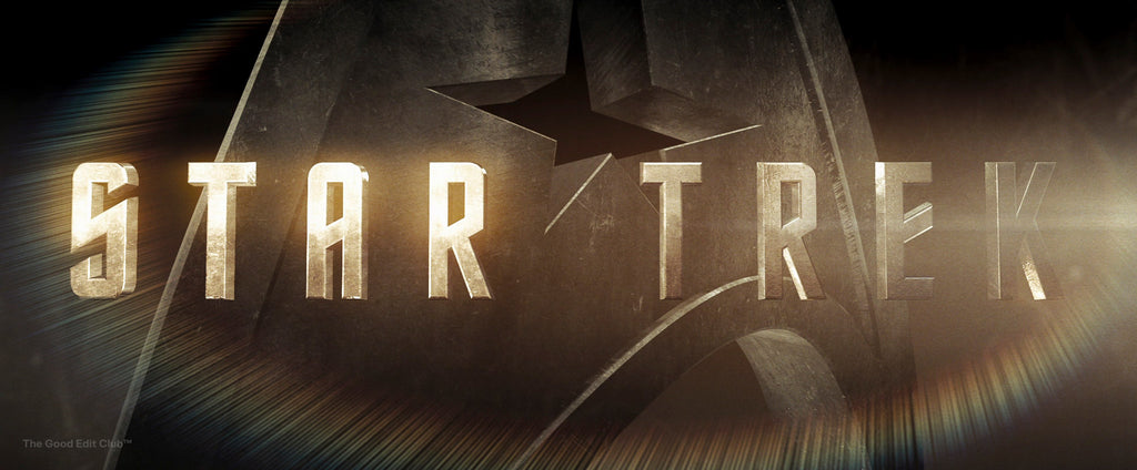
Star Trek (2009, Director: J.J. Abrams)
Metallic Typography in Marketing Strategies
Metallic typography leverages the psychological association of metals with value, stability, and futurism in film branding. And it's not just the film industry. Take the unapologetically nostalgic and seductive visuals for Diet Coke's Just Because campaign as an example.
- Perceived Value: Audiences inherently associate metallic sheen with luxury and premium quality, suggesting a high production value.
- Genre Indication: Specific metal textures signal genre, such as chrome for sci-fi and rusted iron for post-apocalyptic themes.
- Memorability: The striking nature of metal titles ensures they linger in viewers' memories, bolstering recall and word-of-mouth marketing.
- Tradition and Nostalgia: Frequently revisiting metallic aesthetics evokes a sense of tradition and nostalgia, connecting new films with cinema history.
- Futurism and Progress: Metallic surfaces can suggest advancement, aligning with narratives that push technological or conceptual boundaries.These visual cues operate subliminally, anchoring the movie's branding in the audience’s psyche.The tactical use of metallic typography crafts an anticipatory mood, priming audiences for an experience that aims to surpass the conventional.
Conclusion: The Timeless Appeal of Chrome Typography in Visual Storytelling
The chrome text effect embodies the intersection of innovation, nostalgia, and storytelling. Its continued evolution and application across media underscore its timeless appeal, proving that this visual style remains at the heart of cinematic and digital narratives.
Bring the timeless elegance of metal to your brand with ease. Dive into our guide, Mastering Metallic: Chrome Machine in Action, for insider tips.
Frequently Asked Questions
What is the Premiere Pro Essential Graphics Template, Chrome Machine?
The Premiere Pro Essential Graphics Template, Chrome Machine, is a powerful tool that allows filmmakers to create visually stunning and distinctive film titles.
How does Chrome Machine achieve its unique look?
Chrome Machine draws inspiration from contemporary chrometype design and seamlessly blends it with a touch of Hollywood's metallic presence, resulting in captivating and memorable title sequences.
Can I customize the Chrome Machine template?
Absolutely! The Chrome Machine template is highly customizable, allowing filmmakers to tailor the design elements to suit their specific vision and style.
Is the Chrome Machine template compatible with Premiere Pro?
Yes, the Chrome Machine template is specifically designed for use with Premiere Pro, making it easy for filmmakers to integrate it seamlessly into their editing workflow.
Will using Chrome Machine enhance the visual impact of my film titles?
Definitely! By utilising the Chrome Machine template, filmmakers can elevate the visual brilliance of their film titles, leaving a lasting impression on audiences and adding a touch of cinematic grandeur to their projects.

